Covid-19 Data Visualization
An interactive Tableau dashboard built on early Covid-19 case data, focused on making confirmed cases, deaths, and mortality rates easy to explore by country.
What I was solving for
Three decisions framed the project:
- Which dataset to use.
- Which visualization tool.
- What the dashboard should actually answer.
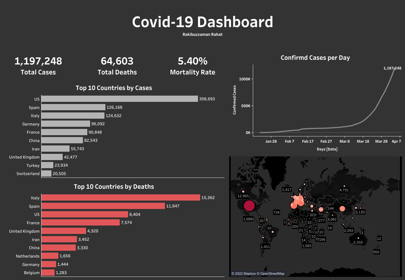
I picked a publicly shared Covid-19 dataset containing confirmed cases and deaths as of 4th April 2020. Tableau Public was the tool since the aim was a shareable, real-time dashboard rather than a one-off report. The end goal: a single view that stays in sync with the underlying data.
Data prep
I exported the spreadsheet as CSV and combined the confirmed cases and deaths sheets inside Tableau. A few columns were dropped (FIPS codes, used only for the USA, and the raw table names).
Three calculated fields were added:
- Total confirmed cases
- Total deaths
- Mortality rate (%)
One edge case: the Cruise ship attribute in the country filter counted 734 confirmed cases and 14 deaths on a cruise ship that had no fixed country. I placed that marker near the Caribbean Islands on the map to reflect the most common cruise routes.
The final dashboard is live on Tableau Public: Covid-19 Data Analysis Dashboard. More of my Tableau work lives on my profile.